
Three New Identifications of Topps Cartoonists

In “Who Drew the Classic Topps Baseball Cartoons, Part I“, we examined the cartoons made by the small number of artists for whom we possessed prior documentation of their work on baseball cards for Topps. In that introductory article I also announced that subsequent installments would provide identifications of five previously anonymous Topps baseball cartoonists. Here in Part II, we’ll look at the evidence for identifying three artists who drew baseball cartoons for Topps in the years 1956, 1958, 1962, and 1968, with a promise of more to come!
The identifications presented here are based on careful comparisons of the drawing styles of the anonymous Topps cartoonists with the works of artists whose cartoons for other purposes were signed or documented in some other way. In all three cases, it can be verified that the artist whose style matches that of the Topps cartoons is known to have been employed by the bubble gum company in some other capacity at some point – we simply never knew that he also worked specifically on baseball cards. So far, I know of no women who drew cartoons for Topps.
When it comes to matching up cartoon styles, chance favors the prepared mind. I began looking at my baseball cards with idolatrous affection more than five decades ago, and I have been searching for the makers of their cartoons fairly intensively for several years now. So when I happen to encounter one of these artists on the street (so to speak), there is a strong sense of recognition at first sight – it’s just like running into an old friend.
* * * * * * * *
The first of the identifications may come as a stunner, and yet it shouldn’t have been surprising at all, given that the artist in question has long been associated with Topps Chewing Gum. His work appears on 40 cards that appear late in the famous and beloved 1956 baseball set. The cartoons of 1956 are fairly consistent in style across most of the 340-card set, with two notable exceptions: a quite peculiar group of thirteen cards in the first series (#1-100) that we’ll discuss on another occasion, and a second exceptional run of cards that comprises exactly half of the fourth and final series (#261-340).
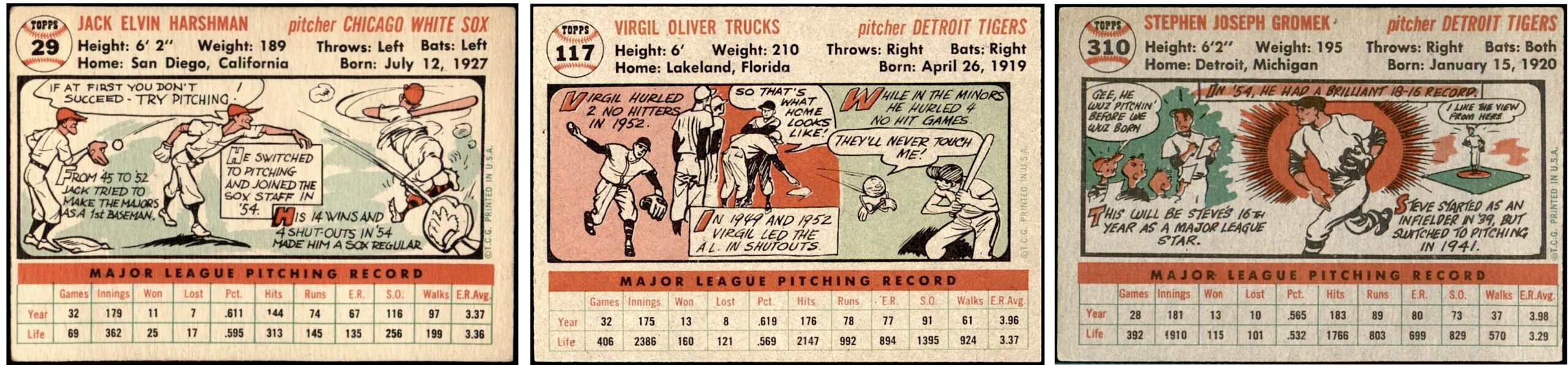
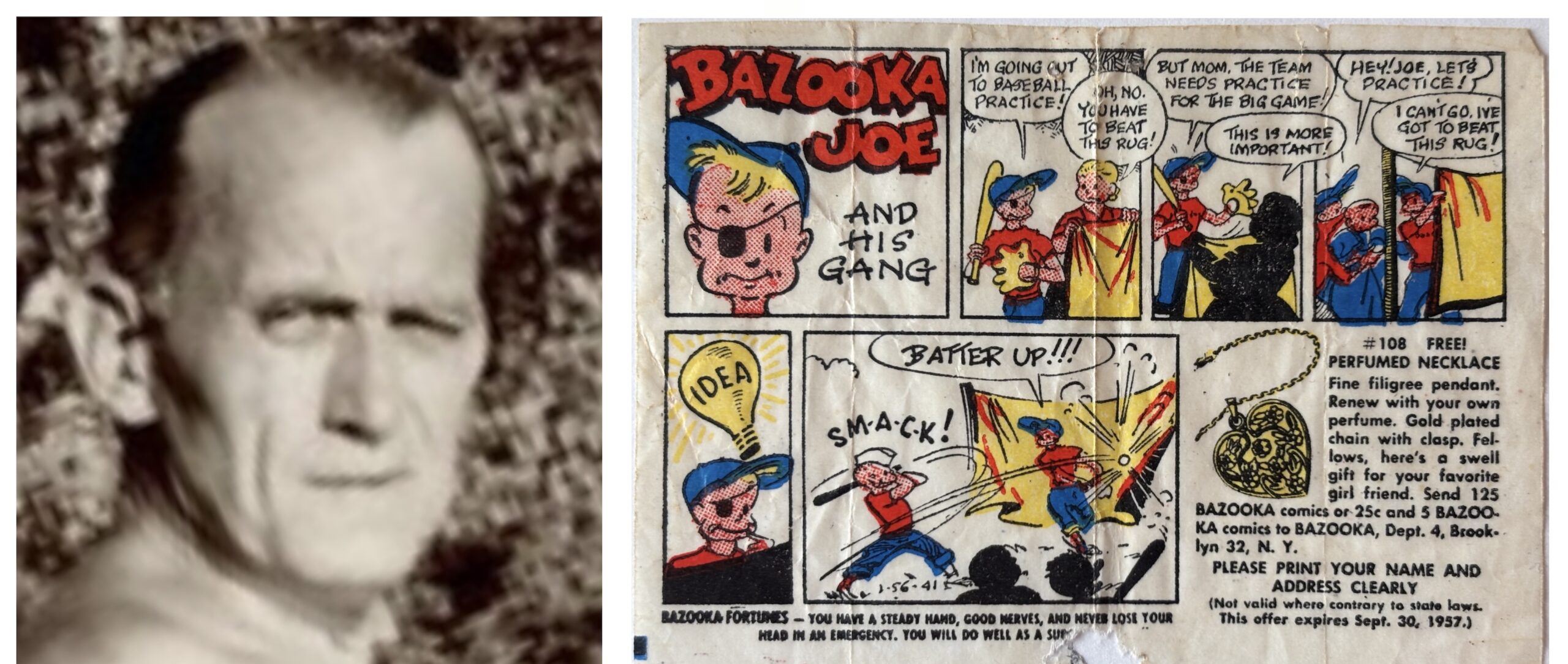
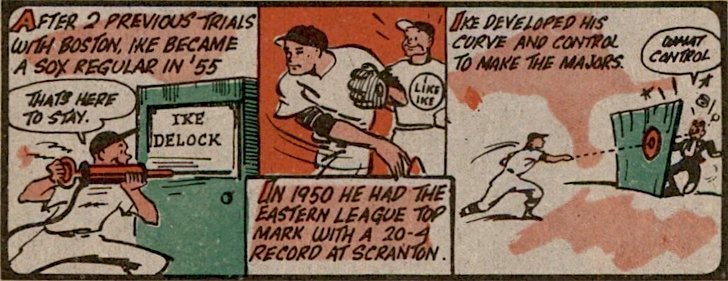
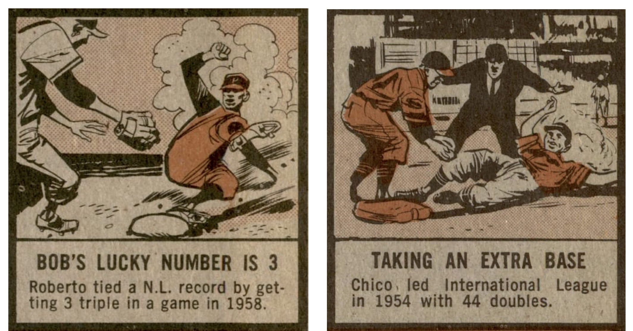
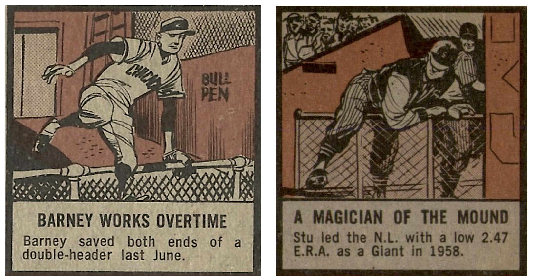
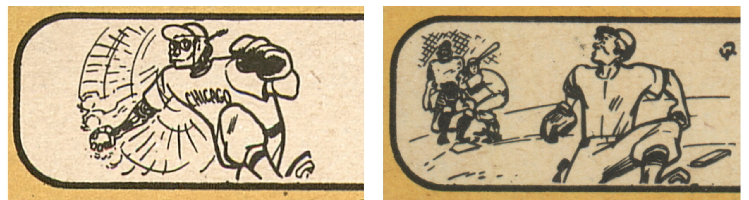
These 40 high-number cards feature spunky little cartoons that are obviously attributable to Wesley C. Morse (1896–1963), legendary veteran of the American cartooning tradition (and underworld) who in 1954 hit the big time by developing Topps’ signature Bazooka Joe strip (“so bad, it’s good”) that came with 1¢ pieces of bubblegum. [Update: Morse’s participation in the 1956 high numbers was mentioned before this page was published, in Toppcat’s The Topps Archives blog (dated June 3, 2023). NB: although all 80 high-number cards were said there to be by Morse, in fact the total was half that many; they are listed below].
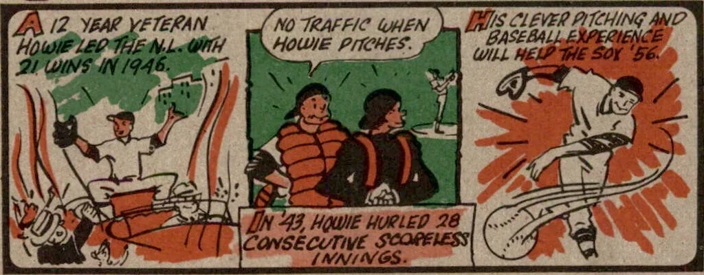
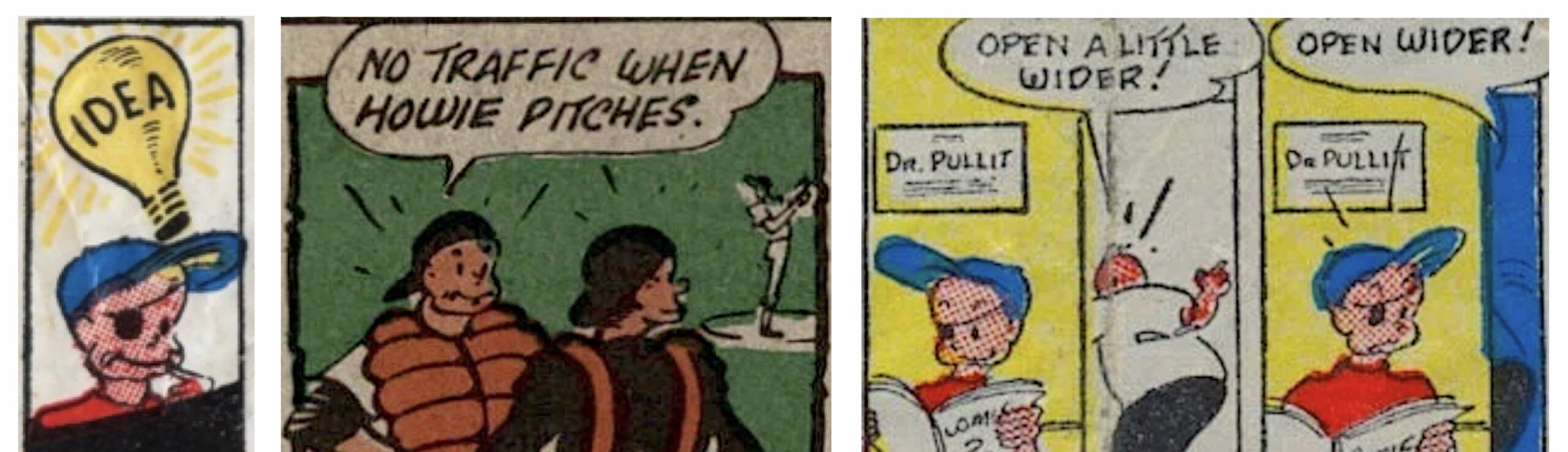
Don’t believe it? Just look at your Howie Pollet card, #262. The cartoon at the left of the panel perfectly exemplifies the characteristic simplicity of Morse’s “Bazooka” style, where the jaunty pose gets it done with gusto, and his extreme economy, where just a few strokes of the pen evoke a ticker-tape parade on a street lined with fans. In the central cartoon, the catcher looks just like Bazooka Joe (but without the eye-patch), and he and the umpire emit the elongated rays that Morse always used to express surprise, anxiety, or just plain “wow”. On other cards, he used long droplets of perspiration to evoke alarm or exertion (#300, 336, etc.). The third cartoon at the right, showing the southpaw’s lurching follow-through, explodes with unruly splashes of background color. Typical of Morse, it’s the kind of high-energy kid stuff that you’d expect with a bubble gum product.

Moreover, in the slightly crowded and wobbly captions of these cartoons, we can see that Morse also did his own lettering. Here and nowhere else in the 1956 set, the letter ‘W’ is always rounded and the top line of the ‘T’ is always slanted upwards, just like in the original Bazooka comics.
The 40 Wesley Morse cartoons are easy to spot, once you know to look for them: #261-263, 269, 271-274, 276, 278, 280, 282-284, 286, 290, 293-294, 296-298, 300, 309-316, 321-324, 327-330, 336, and 339.

Not previously mentioned anywhere (to my knowledge), Morse also brought his distinctive Bazooka Joe style to the 1956 Topps football cards and the final series of the 1958 baseball set, doing 31 cartoons in all: cards #441-448, 450-455, 457-472, and 474.
So much personality comes through these cartoons – from the scrappy drawings to the campy gags to the iffy grammar (“His credentials say’s he’s a good glove man”) – they’re treasures of mid-century American pop culture. I just wish there were more of them!
* * * * * * * *
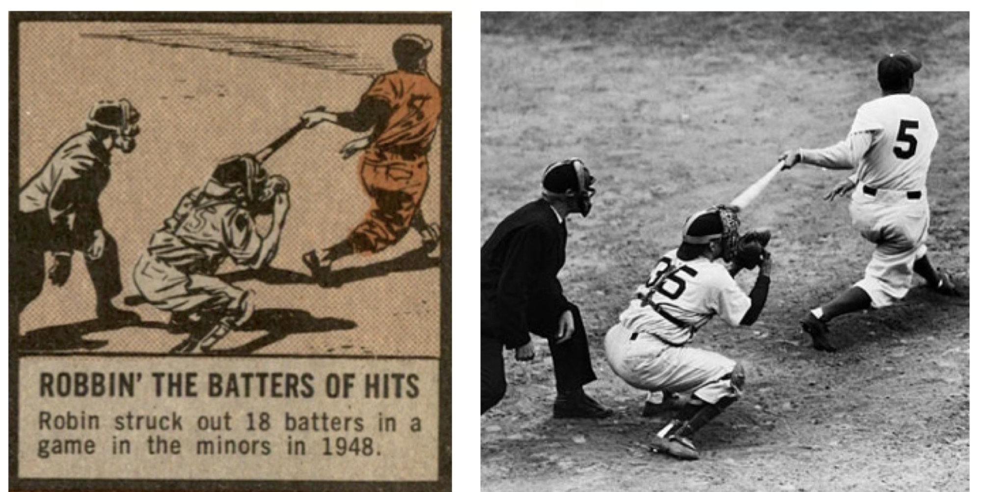
The second Topps cartoonist to be identified here worked on the 1962 baseball set, specifically the 67 cartoons that are not by Jack Davis. These cartoons likewise have a realistic look, with convincing inky shadows, largely because many of them were based on photographic models. However (and this is not a knock on anybody), I see them as comparatively static, with less of the dynamic exaggeration and graphic force that made the Davis drawings so amazing. See the difference?
In an article that appeared in these pages on October 1, 2024, “Drawing Conclusions: Eric White’s Vintage Topps Cartoon Discoveries“, Roy Carlson summarized my discoveries of several baseball action photographs that this artist used as references for his compositions, including famous shots of Stan Musial (card #188), Red Schoendienst (#204), Lefty Gomez (#221), and Cookie Lavagetto (#243), one pitch before his game-winning double broke up Floyd (‘Bill’) Bevens’ bid for a no-hitter in the 1947 World Series, shown below:
Below we see another iteration of the same Lavagetto scene as comic artwork, this time illustrating a story on football immortal Sammy Baugh that was part of the same artist’s extended series of sports profiles in the hugely popular comic book Joe Palooka between 1948 and 1951.
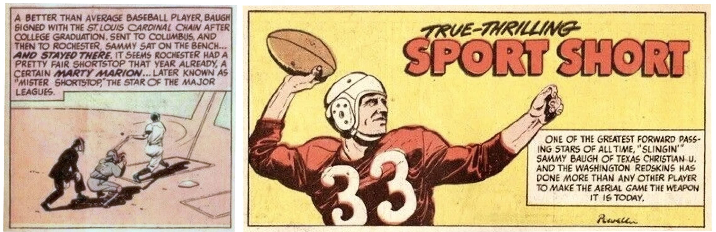
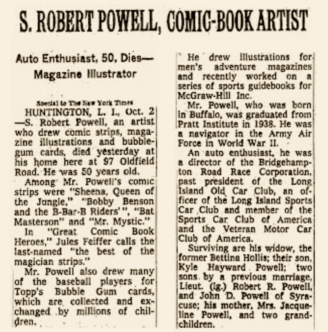
Signed ‘Powell’ in the opening panel, the Baugh illustrations for Joe Palooka were the work of Bob Powell (Stanley Robert Pawlowski, 1917–1967), longtime comic artist who also specialized in war stories, Sheena, Queen of the Jungle, and various superheroes.
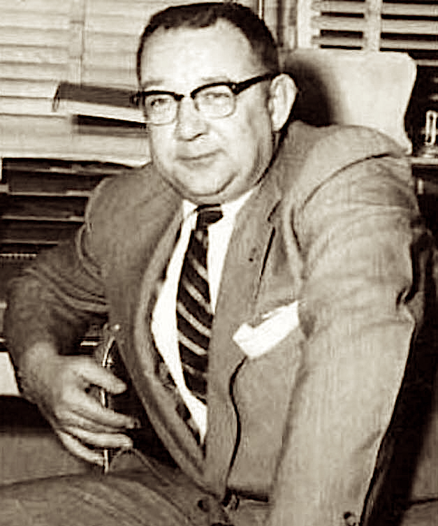
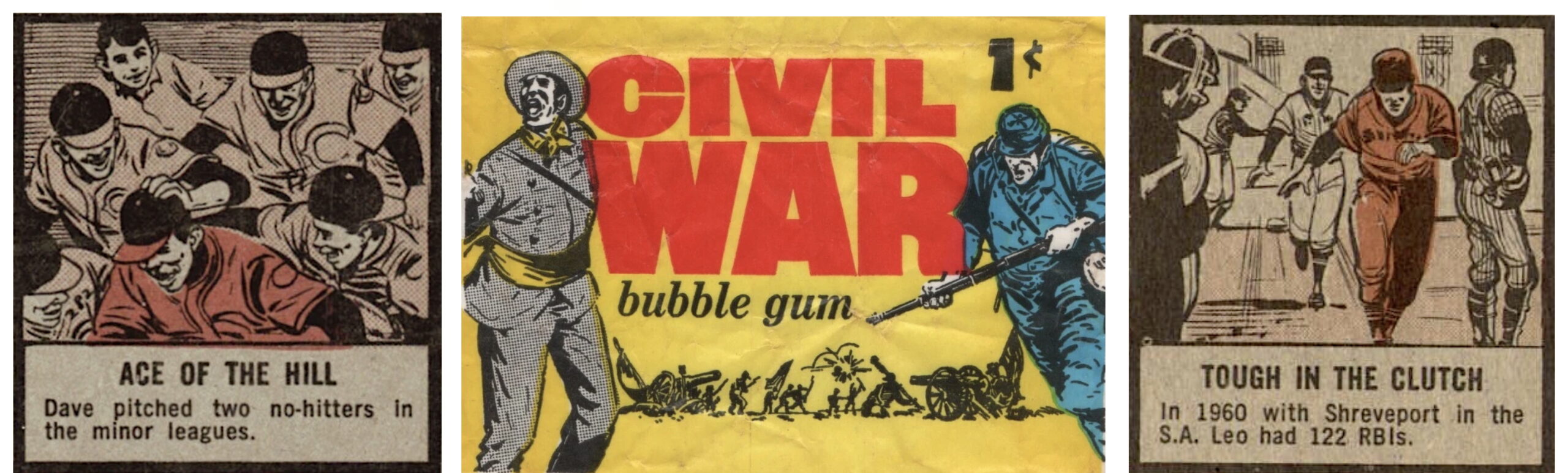
At an unknown date, Powell joined Topps to contribute designs for various non-sports cards, including the gory Civil War News (1962), the gratuitously violent Mars Attacks! (1962), and the amazingly campy Batman (1966) sets, painted in gloriously garish detail by Norm Saunders. The fact that Powell provided the cartoons for Topps baseball cards was mentioned in his New York Times obituary on October 2, 1967 (below), but has been essentially forgotten even since.
Here’s a comparison of some of Powell’s work on the Civil War News packs and on baseball cards, both from 1962:
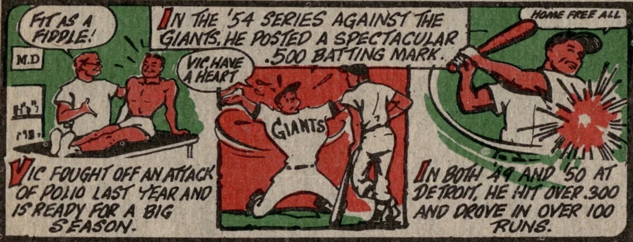
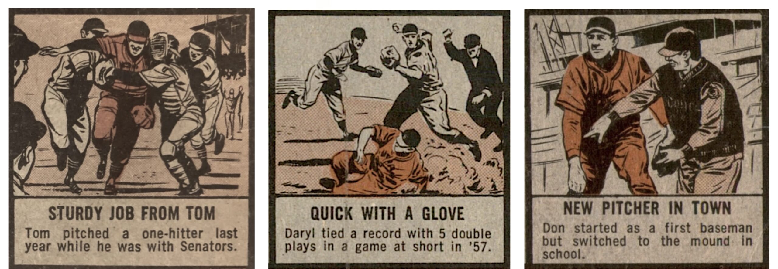
Powell’s ballplayers in the 1962 Topps set were cast in the same mold as his comic book heroes: dark, craggy, and heavy-browed, they are no-nonsense veterans, tough in the clutch, somewhat sluggish but determined baserunners, crafty bunters, savvy hurlers, and hustling fielders. One of his recurring scenarios is the game-winning hero, mobbed by his teammates, who merely wants to keep his head down and duck into the dugout (“I’m just trying to help the team”). The action is convincingly muscular, but not particularly swift or graceful. The ballparks look massive – old, dark, and noisy.
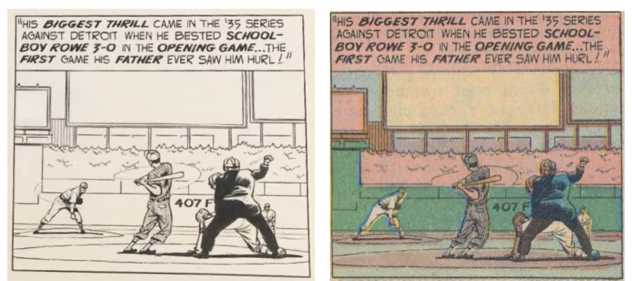
We can gain some insights into Powell’s working methods by looking at 1962 Topps card #196, where another reference photo, showing Bob Feller pitching to Joe DiMaggio during his no-hitter at Yankee Stadium on April 30, 1946, served his purposes well. Powell reconfigured the composition in order to place our view of the pitcher between the batter and the catcher, with the umpire signaling ‘Strike!’ even before the ball arrives.
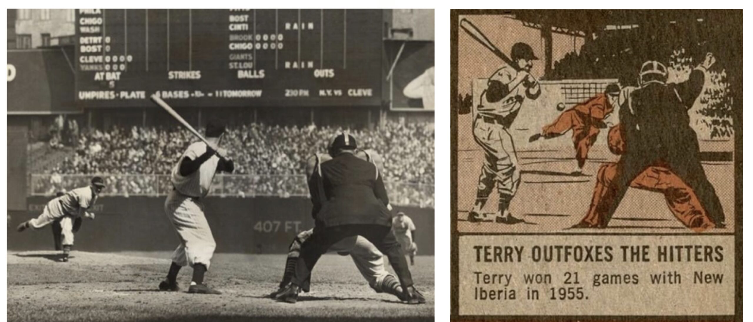
The same photograph had inspired Powell’s unsigned panel illustrating “The Story of Lon Warneke”, published in Joe Palooka #37 in October, 1949. Here, although the batter’s pose has changed, we note a more faithful arrangement of the principal figures, the inclusion of the “407 FT.” sign and the outlines of the large scoreboard, as well as the umpire’s improvised “Strike!” signal.
Given the instant recognizability of the Jack Davis cartoons, the 67 cartoons by Powell are not difficult to spot. They are: #110, 112, 115, 117, 120, 123, 125, 128, 130-131, 134, 146, 148, 150, 154-155, 159, 161, 164, 168, 170, 173, 175, 177, 179, 181-182, 184, 186, 188, 190, 193, 196-197, 199, 201, 203-204, 207, 209, 212, 215, 218, 220-221, 223-224, 227, 230-231, 240, 243, 245, 247-248, 252, 254, 258-259, 264, 269, 272, 274, 276, 279-280, and 282. Thus, the 1962 Topps set is all sewn up – the cartoonists are either Jack Davis or Bob Powell – and now you can sort your set accordingly!
I’d love to find Bob Powell’s photo source for this one someday:
* * * * * * * *
Our third vintage Topps cartoonist identification is one of the four artists who contributed to the 1968 baseball set.
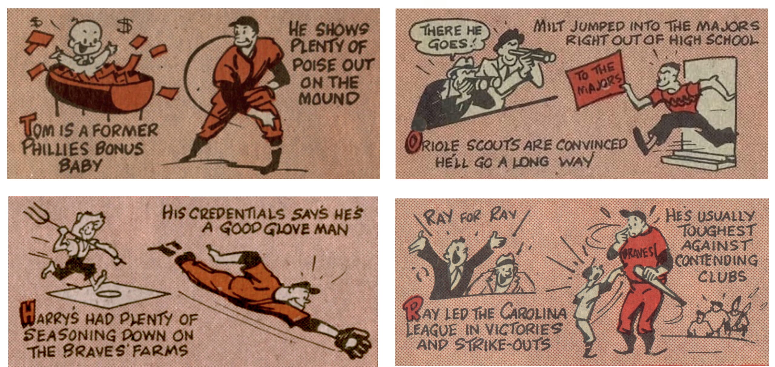
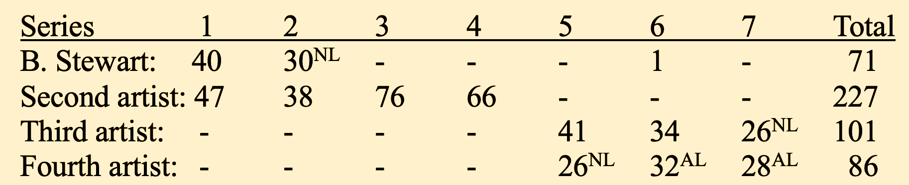
In Part I (linked at the beginning of this article), I attributed 70 cartoons from the first two series of the 1968 set, plus card #523, to Bhob Stewart, a content editor for Topps, whose somewhat awkward cartoons often copied designs from earlier Topps cartoons, as described in the aforementioned “Drawing Conclusions: Eric White’s Vintage Topps Cartoon Discoveries” as well as in Roy Carlson’s “Drawing Conclusions Part 2: More Topps Copycat Capers“. A second artist drew the 47 remaining cartoons for Series One and the remaining 38 cartoons for Series Two, all 76 cartoons for Series Three and all 66 cartoons for Series Four (a total of 227 cartoons). In Series Five through Seven, two new artists took over the work, dividing up the players more or less by league. The third artist, who favored big noses and white hats and socks, drew 101 cartoons; the fourth, who favored childlike faces and black hats and socks, did 86 cartoons:
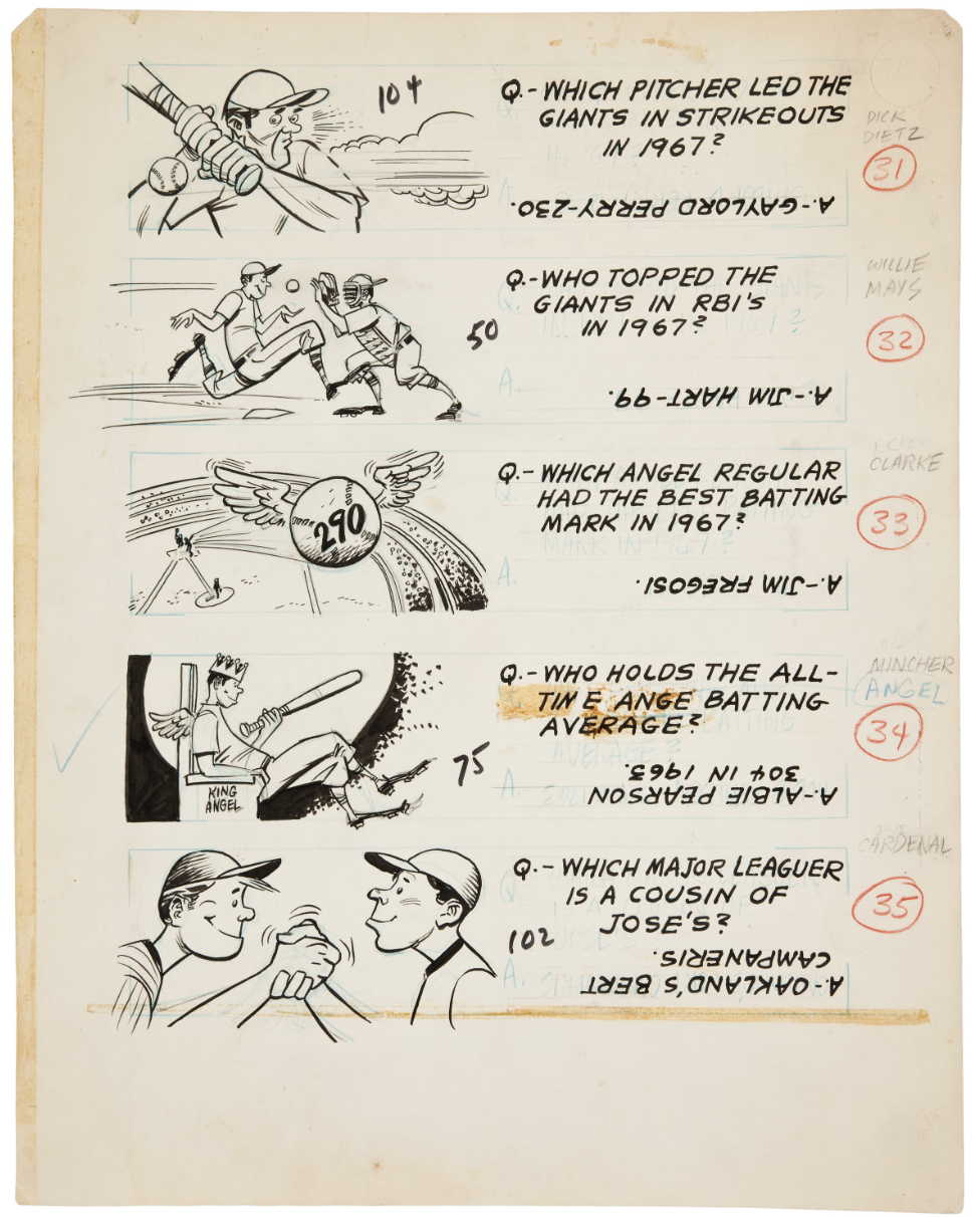
By good fortune at least 27 panels of original cartoon artwork for the 1968 set survive, each with several cartoons drawn on them, totaling 133 cartoons that made their way onto cards (all of the cartoons on a single panel are by the same artist). Two of the panels, sold by Heritage Auctions in 2012, pertain to Series One: the first features the drawings for cards #26, 43, 61, and 106 (numbered sequentially 21-25 in pencil, with an extra cartoon labeled “Chico Salmon” with a quiz concerning a Cleveland teammate that was used instead for card #277 from the Third Series, Jerry Buchek of the Mets; the second panel, illustrated below, features cartoons for cards #50, 75, 102, 104 (numbered 31-35, with an extra cartoon labeled “Rickey Clarke” that was never used).
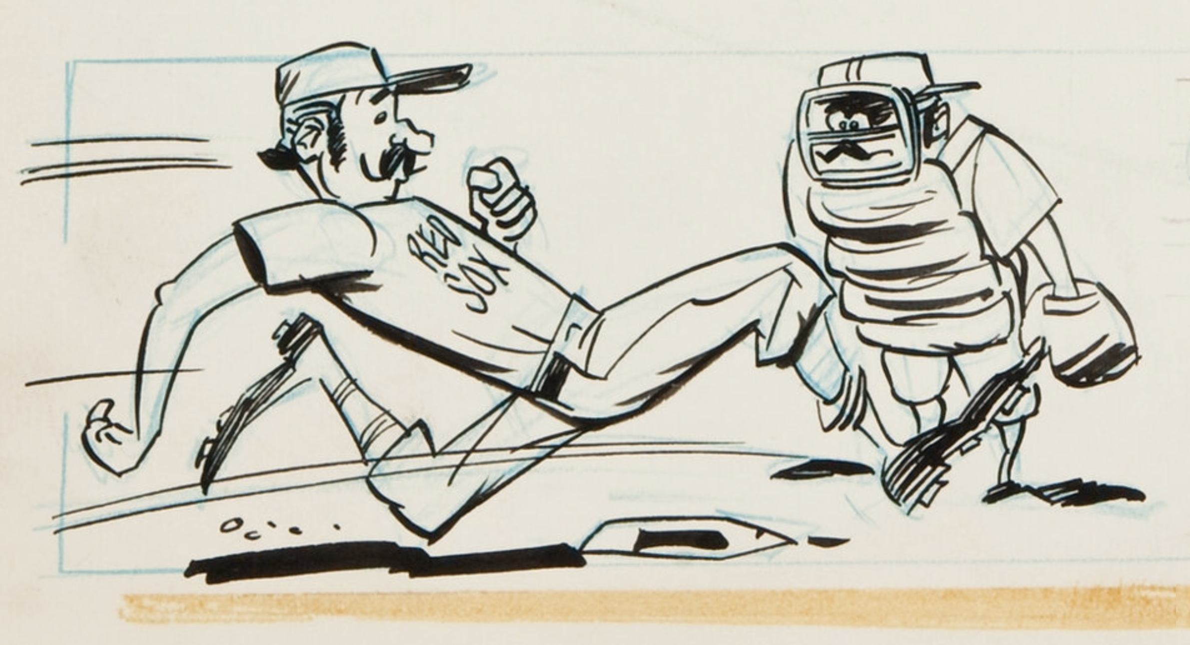
Both panels appear to be by the same artist. They both include a cartoon of a runner crossing the plate with impossibly long strides (#50 and 61) and feature players with prominent jaws, shallow bowl-shaped caps, striped socks like the Boston Red Sox used to wear, and elongated shoes, sometimes with extensive areas of inky shadow that the other artists in the 1968 set rarely used. The cartoon for Reggie Smith’s card #61 (below) purportedly shows Jimmie Foxx scoring in 1938, but characteristically exaggerates the antiquity of the event, adding mustaches that make it look more like the 1890s.
If you’re sorting your cards along with us, 47 cards in Series One belong to this superior artist: nine found on the panels discussed above (listed here in bold), plus these: #14, 17, 19, 20, 21, 22, 25, 26, 32, 33, 35, 39, 40, 42, 43, 45, 46, 50, 51, 53, 57, 58, 59, 61, 63, 68, 70, 71, 72, 73, 75, 78, 81, 82, 84, 85, 86, 92, 94, 95, 97, 98, 99, 100, 102, 104, and 106. Thus, this artist was responsible for all of the Cardinals, Giants, Mets, Phillies, Pirates, Orioles, Red Sox, Tigers, and White Sox (39 cards) in this series, and he split the drawing duties for the Astros, Angels, and Indians (8 cards) with Bhob Stewart.
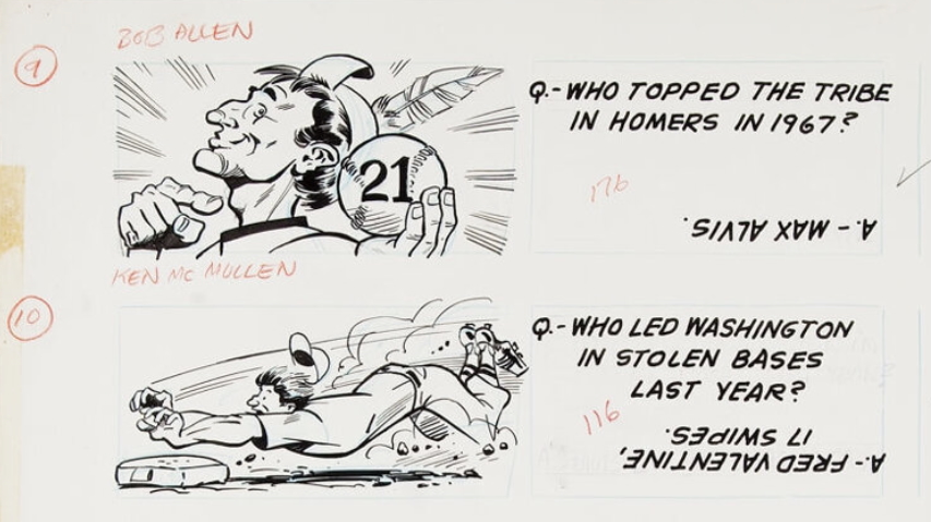
Another panel of four original ink drawings for Series Two, cards #116, 131, 149, and 176 (illustrated in part above and at the end of this article), is by the same artist who did the previous panels, admittedly with somewhat bolder outlines and richer detail. Based on the style established in these panels, the hallmarks of this artist’s work are figures that are relatively well-modeled and muscular, with brawny chins, small noses, and high cheekbones (#115 and 140). They swing their bats cross-handed at almost every opportunity (#111, 129, 173, 174, and 193), and two of the pitchers kick up the wrong leg as they wind up to throw (#163 and 194).
The stadium views and outdoor scenes by this artist (#133, 143, and 195) are spacious and well composed – the cartoon on the back of Bob Tillman’s card #174, meant to recall Mickey Mantle’s home run swing (“KRAK!”) in a sweeping stadium scene, is a mini-masterpiece, despite having the wrong hand on top.
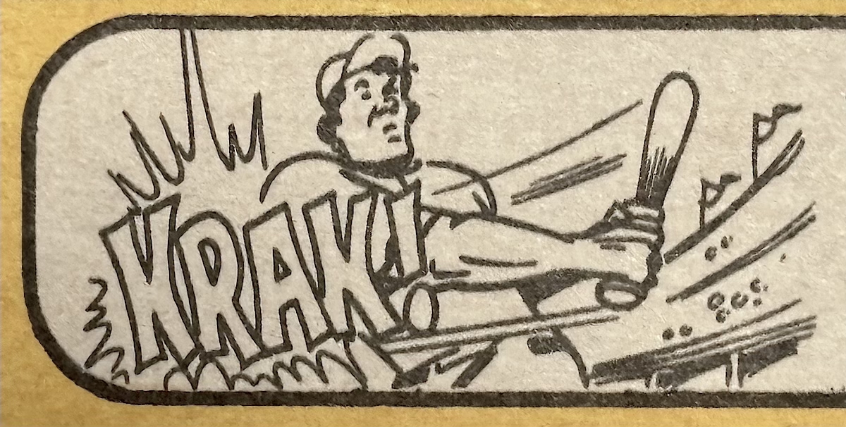
Perhaps perceiving that the more detailed treatment found in Series Two expended too much time and ink, our cartoonist made the drawings simpler again in subsequent series. In all, he did 38 cartoons for Series Two, including 33 American Leaguers (cartoons represented on known panels in bold): #111, 115, 116, 118, 120, 121, 123, 124, 125, 127, 129, 131, 133, 135, 138, 140, 143, 146, 149, 160, 163, 164, 165, 167, 170, 172, 173, 174, 176, 178, 181, 186, 188, 189, 191, 193, 194, and 195.
A dozen more original artwork panels for the 1968 cartoons were sold together at a Heritage Auction in August, 2022. They each feature five cartoons by this same artist, for a total of 60 dispersed across Series Three and Four. Seven of the panels by the artist we’re investigating pertain to 35 of the 76 cartoons required in Series Three (cards #197-283), again with each of them assigned a sequential number in pencil:
Panel 6-10: #213, 230, 260, 266, 274
Panel 16-20: #207, 215, 227, 245, 262
Panel 21-25: #198, 208, 246, 249, 281
Panel 46-50: #210, 229, 248, 259, 268
Panel 51-55: #212, 233, 250, 265, 272
Panel 56-60: #220, 224, 244, 261, 282
Panel 66-70: #197, 218, 234, 271, 280
This leaves 40 cartoons remaining to consider in Series Three, given that we’ve already dealt with Buchek’s card #277. All 40 cartoons not found on the panels can also be assigned to this same artist. I could spend more time explaining the visual evidence for this, but please notice that the artist numbered his (known) Third Series cartoons up to 70; it would take just one more panel of five and the previously drawn card #277 to wipe out the whole series. Thus, it stands to reason that a single artist drew all 76 of the Third Series cartoons.
The Fourth Series required 66 cartoons on the cards numbered between #284 and 370. Five more panels of cartoons, all drawn in this artist’s superior style, account for 25 of them, again with each one assigned a counting number in pencil:
Panel 1-5: #310, 322, 324, 335, 350
Panel 31-35: #290, 309, 311, 351, 360
Panel 36-40: #286, 304, 333, 344, 355
Panel 51-55: #296, 330, 339, 349, 353
Panel 61-65: #298, 300, 315, 332, 357
By stylistic comparison, all of the remaining 41 cartoons in Series Four are likewise by this artist. Any mystery behind these attributions should disappear when one considers that the cards that we have not assigned to him are by the third and fourth artists who worked on this set, whose styles look nothing like his. On that basis, we can be fairly certain that he did 47 cartoons for Series One (numbered up to 35), 38 for Series Two (numbered to 12), all 76 for Series Three (numbered to 70), and all 66 for Series Four (numbered to 65, with the captions for the 26 National Leaguers from #284 to #359 added by a different letterer who also did the 28 American Leaguers from #534 to #596) – a total of 227 cartoons. Thus, this heretofore nameless artist emerges as the principal contributor to the 1968 set – no one else produced more than 101 cartoons.
Not previously noted anywhere, as far as we can tell – not even in the auctioneer’s description of the twelve panels when they were put up for sale in 2022 – is the fact that all seven of the Series Three panels (including the one illustrated above) bear a rubber-stamped name and address in the lower right hand corner:
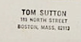
Was 189 North Street, Boston, MA 02113 the business address of a dealer in art supplies? Or was this the stamp of an avid baseball cartoon collector? Neither! Ladies and gentlemen, the owner of this stamp was none other than the highly talented and prolific comic artist Tom Sutton (1937–2002), a man of a thousand styles, long based in Boston, who introduced Vampirella (1969) and developed many other famous (mainly creepy) comic books for Marvel, DC, and Charlton from the Sixties through the Nineties. Moreover, Sutton joined Topps in 1967 through the influence of Bhob Stewart and provided art for several non-sports products, including the paintings for the popular Wacky Ads stickers (1969), the precursors to the more famous Wacky Packages.
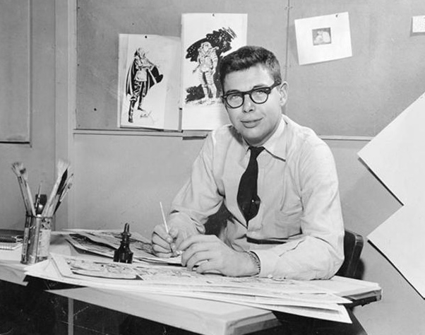
I have never seen cartoons for baseball cards mentioned in any of Sutton’s biographical blurbs, and he himself seems to have avoided referring to them. Recalling his years with Topps in 1990 (in Comics Interview #80, p. 48), Sutton said “I did a hell of a lot of stuff, made some of the best money I ever made, doing Topps gum cards […] they were gross; dumb little kid cards […]. It was crap, but it was endless, you could make tons of money at it”. So we lack confirmation from the artist himself that he drew baseball card cartoons, but who’s going to argue with the smoking gun provided by original cartoons on boards stamped with the name of a cartoonist whom Topps employed to make its Wacky Ads stickers the following year?
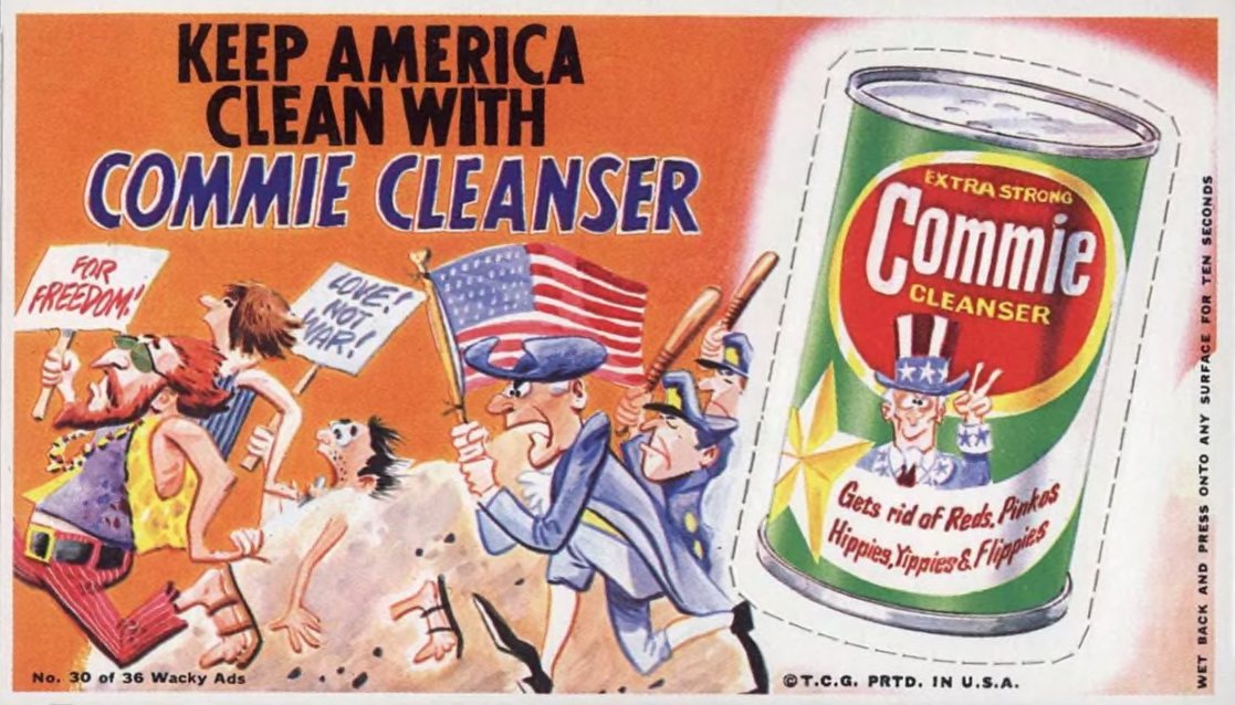
The style of Sutton’s 1968 Topps baseball card cartoons, which represents precisely the kind of work that he dismissed as “mindless”, doesn’t match up in an overt or obvious way with Sutton’s signature efforts in major comic books. However, general similarities to his work on the Wacky Ads do emerge, including some facial types, elongated shoes, and even some striped baseball socks:
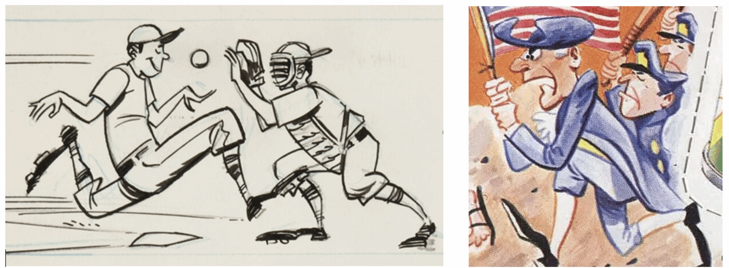
Also, check out Sutton’s work in this Marvel Comics spoof of Ernest Thayer’s “Casey at the Bat” (Not Brand Echh # 9, August 1968) – darned if he didn’t get the pitcher kicking up the wrong foot and the hitter holding the bat cross-handed:
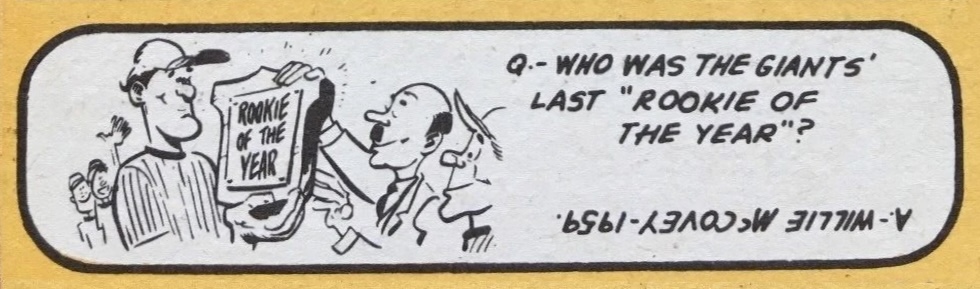
Three little oddities that arise among Sutton’s 1968 baseball cartoons are worth a look. First is the cartoon on Bob Barton’s card #351, showing a tall white player named Willie McCovey accepting the Rookie of the Year Award from a bald guy with a Hitler mustache. Enough said.
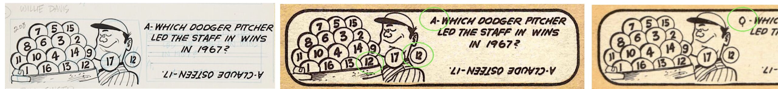
The second one is double trouble. The cartoon for card #208, Willie Davis, is supposed to highlight Claude Osteen’s club-leading 17 wins, but Sutton drew only sixteen baseballs in the pitcher’s basket. Thinking he had forgotten to include victories 12 and 17, Sutton drew them off to the side, not realizing that the twelfth ball was already in the basket. In the original drawing, it looks like he tried to cross out the extra ball, to no avail. On top of this, the letterer introduced the quiz with an “A” for answer instead of a “Q” for question. This got corrected in some of the cards, but not all – it’s an error variant that nobody seems to have mentioned. Which do you own? Both?
Thirdly, as a special bonus for those of you who are still reading, it’s time to tell the saga of a funny little snafu involving two cartoons on Sutton’s Series Two panel. As might seem inevitable when drawing 227 cartoons, two of them got matched with the wrong captions. Clearly, you don’t depict an RBI leader in the act of being called out on strikes, and you don’t celebrate an ERA leader by showing a batter pulverizing the baseball (“POW!”).

Someone caught the error and penciled in the instruction to “switch cartoons”; another editor, who assigned the cartoons to Frank Bertaina’s card #149 and Bob Saverine’s card #131, respectively, added the helpful note, “Switch Pics 12 to 11”. Sure enough, they got switched in production. If you look at your cards #131 and 149, the RBI leader is striking out on Saverine’s card, not on Bertaina’s, and the ERA leader’s offering is getting crushed on Bertaina’s card, not on Saverine’s. Thus, the emergency switcheroo completely missed the point: the cartoons were supposed to be matched with different captions, not with different players! But that’s what’s so great about seeing the panels – decades later, we can finally understand exactly why these cartoons never made any sense.
* * * * * * * *
Given what we’ve seen here and in Part I, we can say that Irwin Hasen did the majority of the cartoons for the 1955 Topps baseball cards, Wesley Morse brought his signature Bazooka Joe style to the 1956 set, Murray Olderman worked on the 1957 set, while he and Morse shared some of the duties for the 1958 cartoons, Jack Davis did substantial work on the 1959, 1960, 1961, and 1962 sets, Jack Kirby contributed to the 1960 set, Bob Powell helped with the 1962 set, while Bhob Stewart and Tom Sutton did all but 187 cartoons for the 1968 set. But 1962 aside, we’re a long way from knowing who drew all of the cartoons for these sets, and the same is true of two dozen other sets. Clearly, there is much more work to be done. I’m hoping knowledgeable collectors can provide more information, or that a reader will write in and say “The 1959s were by my Uncle Moe!”
Meanwhile, I’ll keep at it in the next installment, Part III, where I’ll identify another forgotten artist who drew the classic Topps baseball cartoons.
Continue to Part III.
* * * * * * * *
Eric White can be contacted at ewhite1455@gmail.com